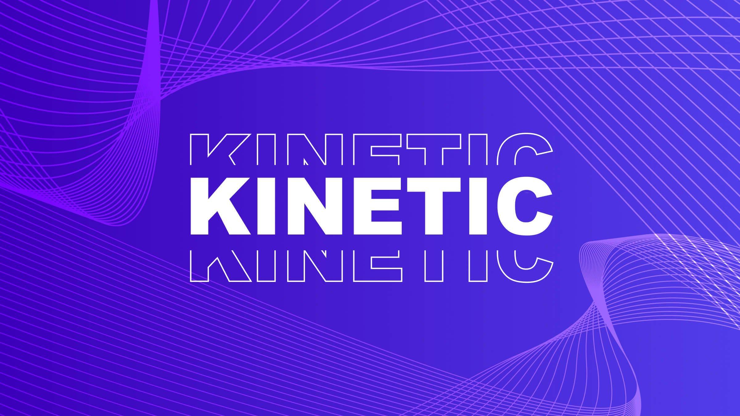
Fast and kinetic typography has swept the video world. Embrace the kinetic typography video trend with these top templates.


Since Apple’s famous “Don’t Blink” video first appeared on our screens, fast typography has continued to grab the attention of audiences around the world, with brands such as Samsung and Honda adopting the so-called ‘stomp’ style in eye-catching, fast-paced marketing campaigns.
For designers and content creators seeking visually engaging and energetic video trends in 2021, fast typography offers a great opportunity to speedily share a lot of information. Use fast typography to add an action-packed element to your next project with kinetic typography templates from Envato Elements.
What Is Fast Typography?
The functionality behind this type of animation and design draws on the learnings of Evelyn Wood, an American educator and businessperson who popularized the term “speed reading”, as well as building the systems that encouraged it.
The basic concept is to display text word-by-word, or in small groups of words, one after the other. This way you can speed up the reading process by increasing the average rate of words-per-minute that are displayed on the screen.
How Can I Create Animated Typography?
In an era where we’re constantly overwhelmed by the amount of information being thrown at us, the popularity of templates that help deliver messages in fast, visually engaging ways has risen. As a result, video is widely recognized as the ideal medium to deliver this type of content, which is why it’s no surprise to find it increasingly popping up in video marketing strategies.
The good news is, it couldn’t be easier to create your own text-based animations using a range of video templates. Whatever your directorial experience, if you have aspirations of being the next Spielberg, our round-up of free video tutorials and courses can help point you – and your camera – in the right direction.
And when it comes to creating your own fast fonts, you’ll find it’s simple to make kinetic typography in PowerPoint while there are customizable templates out there for both After Effects and Premiere Pro.
If you need a little inspiration to get you started, check out our speedy slideshow of stomp video inspiration to kickstart your fast typography project.
Top 10 Fast Typography Templates
Ready to put your words into motion? Here are some of the top fast typography templates on Envato Elements.
1. Kinetic Titles | FCPX by Gamma_Shop


From conferences to commercials, there’s never a dull moment with these flashing and flickering titles. White letters on a black background make a bold statement, while a few glitch video effects introduce an element of grit and grunge.

2. Kinetic Typography Intro by BLAQMATRIX


Motivational multimedia content starts with bold statements and animated words, and this video template delivers dynamic titles by the truckload. Modern and minimal, the option to overlay images with fast typography means you instantly get your point across.

3. Kinetic Fast Intro by -sparta-


Create a consistent look and feel across your Instagram Stories, your website and your YouTube channel with horizontal and vertical versions of this fast typography video template that takes an effortlessly cool approach to sharing advertising and promotional messages across multiple platforms.

4. Kinetic Typography Slideshow by kimbrush


From music promo videos to sporting showreels, this edgy offering features modern typography and dynamic visuals that promise to add some urban grit and grunge to your work. Accent black-and-white images with colour outlines and add animated words for an all-action opener.

5. Kinetic Typo Pack by Premiumilk


Got some news that you want to shout from the rooftops? Go big and bold with this 3D-effect fast typography template featuring geometric shapes and symmetrical patterns. Swirling, sliding and swivelling text adds an eye-catching sense of movement to this minimalistic opener.

6. Intro Kinetic Typography by Aerocket


For a fashion-forward video opener, this fast typography template is a show-stopper. Introduce your brand, presentation or YouTube channel in a way that no one can ignore thanks to this fast-paced offer that gives designers and creators the option to add images, videos, teaser text and a kaleidoscope of color to their work.

7. Kinetic Typography by Promak


Against a constantly changing stream of images and textural backgrounds, watch as your typography swooshes and slides across the screen to create a sense of unstoppable momentum. Horizontal and vertical formats enable you to achieve a consistent look and feel across a range of platforms.

8. Kinetic Instagram Stories by minimalmovie


If you want your multimedia content to dazzle an audience without detracting from your social media message, then this fast typography treatment is perfect. Designed for Instagram Stories, these kinetic typography templates have a photo-reel finish that makes them ideal for the image-first platform.

9. Typographic Kinetic Posters & Titles by honypix


Whether it’s a motion picture or a social media moment, these vertical and horizontal title credits are definitely going to get the audience’s attention. Packed with creative transitions and eye-catching animation, the design inspiration for these easy-to-customise templates ranges from retro to contemporary.

10. Kinetic Typography by TRM01


Whatever your favourite font, it’s going to have an impact with this host of constantly moving and customisable text-only and text-overlay video templates. Available in a range of vertical and square formats, it’s fast to render and easy to add your text to create a head-turning showreel.

Best Fast Typography Templates 2020
If you’re looking for more fast typography templates, check out our pick of the best stomp videos from Envato Elements for 2020:
1. Stomp opener by Video_Circle


Create an energetic video with this stomp template by Video_Circle. You can insert parts of your video into the template and capture the eye of viewers with this colorful, punchy template.

2. Rhythm GO by blinque


Similar to Stomp, in that it’s also clearly inspired by Apple’s “Don’t Blink” commercial, Rhythmic GO shows what’s possible with some simple black and white typography, and some clever animation.
The way the text can slide from side to side becoming different words each time is genius. Even the way words can light up and fade out, almost like an elevator, shows off the power of indicating concepts rather than showing them.

3. Ultimate Stomp by Deattive


Blend your images and copy together seamlessly in this impressive template by Deattive. It uses your footage to highlight words of your choice, mixing shape elements, color overlays and beautiful animations to engage the eye.

4. Stomp Opener by BRAXXU


Great for commercials, openings and social media videos, Stomp Opener by BRAXXU is easy to use and includes 26 editable text layers, 27 media placeholders and can fit a lot of information into a digestible 35-second format.

5. Stomp Opener by JoeProduction


Combine still images and text into a highly engaging social media video, promotion or opening with this template by JoeProduction. It includes 17 media placeholders, 17 text placeholders and fits it all into 25-seconds.

6. Colorful Stomp by vcgmotion


Stomp videos don’t have to be jolty, they can be smooth like this one from vcgmotion. Featuring soft gradients and playful animations, this template will highlight your copy and images in a digestible way that’s pleasing to the eye.

7. Stomp Opener by Renname


Stomp Opener by Renname is a short and sweet template that’s smooth and modern. The text placeholders animate smoothly and blend seamlessly with creative wipe patterns that transition the background images on and off the screen. There’s also an interesting RBG filter applied to the text and visuals. It feels very current and commands the eye.

8. Don’t Wink – Typographic Intro by MbrEffects


Who likes gradients? Don’t Wink – Typographic Intro by MbrEffects puts fresh white text up against beautiful, bright gradients. Sometimes they’re solid, sometimes they’re not. You can have your text in a box, or out of a box. The choice is yours. The animations are simple but pleasant. And this template overall is versatile enough that you can use it for pretty much any video.

9. Fashion Promo | After Effects Template by Fixik


Extremely stylish and slick, Fashion Promo by Fixit is a great choice for (would you believe it) a fashion brand. It feels modern and is best suited that kind of broad, one word at a time style of commercial. It’s fast and slick, but not alienating.

10. Stomp Promo by Nick_Chavalun


This stomp template by Nick_Chavalun blends copy and footage with animated shapes and parallax effects. It does a great job of using animation to focus the eye on your copy and fits a lot of information into a crisp 24-seconds.

11. Fast Opener by LLmotion


This modern, fast-paced stomp opener by LLmotion features a slick red and black color scheme, which can be customized, and makes your copy the star of your video. Create bold promotions, advertisements and openers using this template which features a modular structure, a 20-second version and longer 40-second version, and easy to use design.

12. Stomp Intro by BarraQda


Looking for a template that’s ready to explode with energy? If so, check this one out by BarraQda. It’s fast and sharp, applying an earth-quake-like effect to the footage and images. This combined with the extremely clean placeholders and contrast in the color palette makes for a quick, easy to interpret video template.

Start your fast typography journey today with an Envato Elements subscription, which gives you unlimited access to our top 10 templates and more. And don’t forget to subscribe to the Envato YouTube channel to check out a whole range of creative tips and tricks.